Thursday, December 17, 2015

UAS

Background:

During the fifth week of school our class was tasked with the objective to both familiarize ourselves with the use of unmanned areal systems (UAV), and to get a general understanding for how the UAV operates in its collection. However, I was unfortunately gone to attended one of my roommates funerals so I was unable to join the class for both the field collection and the lab flight simulator. Instead Dr. Hupy decided that it would be in my best interest to still get acquainted with how UAV data is displayed through Pix4dMapper and understand the general processes of a UAV system without being able to run through the flight simulator or be out in the field during collections.
The collection that was done by our class was on the north bank of the walking bridge shore line near the rivers edge. Dr. Hupy had taken the class out near the study area and flew their predetermined flight path. After the collection was completed all students including myself where asked to generate by a mosaic raster of the images and a DSM of the area.

Methods:

The collection of the data was completed using a multirotor UAV model DJI Phantom (figure 1).
Figure 1: DJI Phantom model used in UAV collection in tidal zone near University of Wisconsin Eau Claire
In order for the UAV to work and capture images you have two options. The first is a manual flight where you control where and when each data point with picture is taken. The Second is by utilizing a program called mission planner which is a program that is utilized in the lab before one enters the field where you can predetermine both the flight the UAV will take and how many photos will be captures within the flight. (figure 2).
Figure 2: generic model of a mission flight plan, generated in lab setting and would be used as flight for survey. Controlling speed, pictures, and path.
Since our project did not require a lot of photos nor did it need a specific path to travel we decided to run the Phantom manually. The area that where photographed where to zones one was a circle with the number 24 in the middle located near the tidal zone of the river. Both the circle and the numbers where created using various rocks. The second area surveyed was the intertidal zone where the class was spectating the UAV being flown. Both surveys offered very different aspects to show the general abilities the UAV collection can offer. For example the first survey of the class and the surrounding terrain offered a glimpse of the clarity the UAV can provided. The second gave a slight glimpse into the capabilities for the UAV to generate superb elevation models of any mission it is flown on.

Once all of the photos are collected we then needed to generate a orthomosaic. Which is a mosaic that utilizes geospatial references to directly lay the photos in the exact location spatially on the earth. It accomplishes this by using the internal GPS unit within the UAV. In the lab we used Pix4dMapper to upload and process our photos collected. The task of generating the orthomosaic is a simple task and can be done in three steps, 1) open Pix4dMapper 2) open new project and upload all photos for your survey 3) a lot of patients. The program itself has to process a plethora of text files and coded inscription along with running countless amounts of mathematical equations in order to not only produce a raster mosaic of your survey but to also have the mosaic spatially implanted into any area. Since this is the case you should expect any project including more than 30 photos to take a minimum of hour to two hours to run.


Results:

Although the program may take a long time to produce an image the reward is definitely worth the wait. After the program generated the mosaic you now have both clear and accurate maps of any survey area you flew. The only variance you will have in quality is based on the number of photos and angles at which the photos where taken. The more photos and angles the more accurate and clear your mosaic will turn out, but will require more time to process.

The first collection the study area were everyone was watching the flight of the Phantom shows a variety of possible aspects the UAV's can capture. It displays not only the ability to display separation between structures like the people standing on the ground. It can also capture elevation within the picture allowing you to display true heights of features. and through rendering in Arc Scene you can display shading bring more contrast to the picture showing even more detail in all the features all of which can be seen in figure 3.
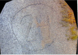
Figure 3: Mosaic generated from Pix4Dmapper 


The second collection and output is my personal favorite for although there was not much contour to the area I could not believe the quality of the mosaic. It not only depicted the 24 within the rocks but it also had detail to the extent where you could see all the individual rocks within the tidal zone. After altering the shading and light contrast I was able to generate a amazing oblique image that shows the slight elevation changes in the feature but also the clarity within the photo itself. (figure 4).


Discussion:

Although I am very disappointed I was unable to see the UAV in action and experience the ability it has. I am very glad I was able to witness the final product that one can create. Even from a simplistic survey such as the two our class took that only had at most 100 photos the clarity and accuracy was superb. I can full comprehend why so many people have started to become open minded and eager about utilizing UAV more into surveys and scientific studies for there ability to capture unimaginable imagery. However, I also would aid on the side of caution that although this new technology is cutting edge and out produces most of the products available to us we all need to remember to follow all flight guidelines and also to not survey unethically. Just because we now have the ability to fly farther and survey more does not mean we have the right to do so.

Tuesday, December 15, 2015

Navigation of Priory with Compass

Introduction:

Map and compass have been a suitable method of navigation for many years until the development of Geographic Positioning Systems. However, even when GPS are present they can malfunction or break and leave the user to use traditional methods of navigation. 

In this exercise we where tasked to use our maps made in the previous week of the Priory to navigate to five points located throughout different location within the priory land area. The priory was chosen as a site to conduct the test for it is an area of land owned by the campus but over the few years of owning it the priory has not found much practical use for our student population. because of this we decided that with the multiple terrain types we would be exposed to many challenges with our traditional land navigation. Throughout the priory we had sever elevation changes, multiple vegetation changes, and even small portions of water (pond and a creek). 

Methods:

To conduct the land navigation we needed to make sure we had the proper equipment
  • Two maps printed on paper ( 1 UTM, 1 WGS)
  • Compass
  • Ruler
  • Marker
After we had all of the tools we first where given a crash course on how to use the compass to determine our direction in which we wanted to walk. As we where standing in the parking lot Dr. Hupy showed us that to use the standard compass we first needed to find north. this is accomplished by  putting the red arrow inside of the red outline, also known as putting the red in the shed. This shows you where true north is. Once you have found this it is wise to orient your map with the north in the same direction.(Figure 1.1) By setting the anchor point of the compass on the bottom at your starting point you then will aim the directional arrow to the destination point. After your start point and directional arrow are in a straight line to your target you need to put the red arrow back into the red outline. A full tutorial can be found on the USGS website (http://education.usgs.gov/lessons/compass.html).  Once completed the degree marked by your directional arrow is the degree in which you need to walk. Follow getting the directional degree you then need to measure the distance to find how far you need to walk. By using the scale you will know your total distance needed to reach the point. Knowing this distance and the amount of steps it took to walk a hundred meters determined in the previous class as 60 paces equals a hundred meters you can do a simple cross multiplication to know how many paces it will take to walk the distance. 
Once the distance and direction are determined we then needed to take action and pace off our path. We accomplished this in a team effort by having the first person determine a land marker in the direction we needed to keep and the second person would pace off how many steps counting every right foot placement as one to the landmark. The note taker would follow the first person and record how many paces it was. Once the first person would reach the landmark the original compass holder would then pace to the same landmark to reassure the pace count. The process would then be repeated until you reached the theoretical pace count.

Figure 1.1 showing compass similar to the ones used in our activity and orienting the compass north with the map in same direction.
Once in the woods we needed to use our knowledge and best estimate as to how far our actual pace count would be. For example we paced off the direction until we reached our theoretical pace count but if we did not see the destination we then continued to count until we reached the marker. In our test they where trees with pink ribbon around then. For some of the points if we where walking up steep inclines or through thick brush our steps where not as long as the original paces taken on the flat sidewalk and in some cases our pace count almost doubled in length. Since this is the case you need to use best judgment to know if your are stepping the same distance as on the sidewalk. Lastly the only other technique that we needed to use was a mathimatical equation to get around hazardous areas. In one of our paths we would have needed to walk down a steep decline with garbage ( iron tubs at the bottom, however, we avoided the area by walking in a safer direction and then turning 90 degrees to our original land mark noting how far each pace was on the two lines and used a simple equation of a 90 degree triangle a^2+b^2=c^2 figure 1.2. This equation allowed us to get the hypotinus or straight line step without having to put our selves in danger of harm.
Figure 1.2: side a and b are the two sides that allowed us to avoid the hazard, side c was our true path we needed to take to our landmark. This process allowed us to be safe in our task but to obtain the same pace count and direction

Discussion:

Once a the priory we where given our five points in decimal degrees and needed to transfer the points manually onto our map so we could follow the previous procedure of obtaining our azimuth and pace count. We decided to use the back of the priory right where the concrete meet the door so it was a distinctive spot on the map to measure off of. We then calculated all of our points and started our journey. We had a rough start in our process for although theoretical we where walking in the right direction at one point we began to veer north this caused us to end at our final pace count on the bottom of the first elevation drop and about 50 meters west and down hill of our destination point. As you can see in our track log for most of our points we never walked directly to them. (Figure 1.3). We would get into the general vicinity but then need to walk in both directions visually looking for our target.


Figure 1.3: track log of journey including our five waypoints we needed to locate


Conclusion:

In the end the course was very helpful it allowed us to see the difficulties that can arise if your electronics would fail or I you did not have access to any modern techniques. It also enlightened us on useful techniques of mapping with a compass. Although our group was not very efficient at finding the waypoints and did not do our best at making sure we where on a straight path each time we where walking as one can see from our track log. The activity opened my eyes to how challenging and impressive surveying was before the implication of GPS. The difficulty level for us to find the brightly marked trees was superbly difficult now try and find a small point unmarked. This task would be almost impossible without years of practice and patients.

I am  very pleased I was able to participate in this activity for now I can say I have a greater understanding for what I need to improve on in order to better navigate through the woods using a paper map and compass.

Wednesday, December 9, 2015

Arc Collector

Background: 

Week eleven and twelve of the fall semester we where tasked with the objective to use a new and most likely the next big trend in geospatial technologies Arc Collector. Which is a self generated online collecting applications that can be used through any smart phone or tablet. The technology is very similar to Arc Map but instead of having to collect you points and then import them into ArcMap you now can collect and generate your attribute table directly into the application. This new unique technology is making it easier for an organization or lone person to create feature classes and by overlaying a base map can use his own GPS on his or her smart phone or tablet and collect not only the spatial point or line or polygon, but can immediately enter all of the predetermined attributes including any determined domains or sub types. The cutting edge technology will pave the way to the future and because of this training in these weeks I can say I will be one laying down some tar for the road.

Methods:

Before we could go into the field and collect our points we first needed to become familiar with two things. First how to create our own feature class and attribute domains and sub types. Next we then needed to be shown how to upload our maps and how to use Arc Collector. 

First when generating our feature class we all needed to decided what kind of collection we wanted to do. I decided to collect point data looking into the types of trees related to the number of squirrel nest in them and if there was a squirrel present in the tree at the time. Now that the topic was determined we had to generate specific attributes I wanted to be included. I decided to included the type of tree in its basic form of (pine, oak, maple, birch, ash, and other), I also wanted to know the size of the tree ( less than 5 feet, 5<x<10 feet,10<x<15 feet, 15> feet), I also wanted to record how many nest where in the tree, if a squirrel was present, what kind of squirrel was in the tree (red, grey, black, chip, other) and how many squirrels where in the nest. Finally for each point I collected the date and time.
The collection was completed on November, 23 and I had successfully collected 15 points. 
This first collection was put in place as a practice collection and was to show us any kinks that we may need to work out in our design and utilization of Arc collector program.  

The second map I had decided to design would identify any concrete sidewalk pad within all of the streets between first and second ave in the student housing area near water street Eau Claire Wisconsin. For this collection I decided to over pay a street basemap with the attribute fields including one for dimensions of the pad, type of damage, if the damage needed immediate repair, and if the pad was level concave or convex. I was hoping to generate a hazardous map that could potentially be turned into a web app and allow public access for entire helping the town identify hazardous sidewalks that should be repaired to avoid lawsuit.  

Proper upload of either map was done in similar fashions. Once the feature class was created you then could upload your feature class to arc map online. This would allow you to create your arc collector app. First you needed to log into arc online. Once there you could share services and follow the wizard through the process two key points are however, that you need to change the features to feature access  in order to be allowed full access when entering data. Last when it asks where to upload the feature class to we where to select UW geography folder so we could locate the feature class online. Once the feature class is published if you make any changes to the field domains or sub-types you will have to re upload the new version of your feature class before it will be changed in arc collector. 

Last you then can add you feature class to arc collector by searching the UW geography folder for the name of your feature class. Add the feature class to the base map of your choice and share your map to the UW geography department where you will be able to access it from the Arc Collector app on your smart phone or tablet. 

Results: 

After the first arc collector I was unsuccessful to draw an conclusions as to what types of trees squirrels prefer for nesting. I was unsuccessful in finding significant data for a couple of reasons. One being my lack to accurately identify each tree species precisely. I was using a key given to through the biology department however, it was mainly used during spring using leaf identification but since all of the leaves where gone I was unable to identify for certain the tree species. Second I had numerous issues with my feature class attribute input. For example I did not successfully set up the domains for two of my fields and could not collect tree size or time. Both fields where altered and there for could not be used in the analysis. However, I was able to generate a preliminary map giving a general idea to the potential of this application if working at its optimal ability (Figure 1).
Figure 1: preliminary collection of tree type and both number of squirrel nest and squirrels present in each tree collected. The data used was to highlight any flaws made in the feature class and prepare to make final collector map for practical use in the field
 

Figure 2: collection of damaged cement pads through all streets
between first and second avenue within the water street district
of Eau Claire Wisconsin
The second collection was much more successful since I was able to correct some of my mistakes in our practice collection. However, I still could not fix the time field and after communicating with other peers I found this to be similar case with all students. 
Although the rest of the collection was very smooth and allowed me to identify potential hazardous areas where the sidewalks should be fixed. As one can see in figure 2
the two main areas that need immediate attention are on second avenue located on either side of Niagara street. The second location was most of Broadway street where a lot of the pads had sever cracks. 


Conclusion:

In the end I was able to obtain a better understanding for the implications Arc Collector could have on our future. It was very interesting to see technology becoming so advanced that we can now have very detailed spatially accurate collection from the one device that so many Americans already use everyday. I was a little disappointed in the fact that the application needed data at all times and would not be useful in situations where service was unavailable or slow service would make for inaccurate and slow collections. All together I can say I learned a lot about Arc collector and now know a little more about designing my own feature class and generating domains and sub types along with more knowledge on when is an appropriate time to create a sub type or make a new field. 
I am very glad I was introduced to Arc collector and can even say that I have been using it in my personal life as well by creating a fishing application that will help me to analyze the behavior of fish throughout my trips narrowing down on patterns and hopefully produce more fish fry for myself. 
Although this was just a scratch at the surface of what Arc Collector can do I hope this will not be the last time I have to use this application for a company project. 

Sunday, December 6, 2015

GPS and Total Station

Background: 

Figure 1: Topcon Tesla Unit for GPS point collection of mall at
University of Wisconsin Eau Claire
for weeks 9 and 10 our class was tasked with the objective to utilize two different methods of collecting survey grade point collection of the campus mall area. Our first collection utilized the Topcon Tesla (survey grade GPS unit figure 1) and also the Topcon Hiper SR (survey grade elevation calibrator figure 2). The week that followed our collection with the Tesla we where then to survey the mall area with the Topcon GPT-3100W total station. The total station is a stationary survey grade unit that shoots a laser to a 2 meter high reflector that allows you to collect multiple points from without having to move you collection station. After the two collections where finished we where to generate two separate continuous surface models and determine the pros and cons of each collection method to determine the best fit for each collection. 
Figure 2: Topcon Total station used in our second collection of
the mall of the University of Wisconsin Eau Claire


Methods: 

In week nine we where set out with the Tesla to collect a total of a hundred points within a 25 x 25 foot plot. Although our collection was easy there was a few stepping stones we needed to overcome before we started the collection. First was that we needed to connect to both the WiFi and the hyper unit in order to be able to collect elevation. We had a lot of complications with the connection and found that you first needed to turn on the Tesla unit before connecting to either of the other two units. Once connected we then needed to create a job to store our collection points. This was also an issue for the licensing for the Tesla had recently been canceled and we where only able to collect a total of 25 points per job. Because of this we needed to make for different jobs to collect a total of 100 points. Once the set up was complete we where able to start collecting our points. To accomplish this we needed to make sure a couple of preliminary objectives where completed. First we needed to make sure the hyper was level by shortening or extending the legs of the Hiper unit. Once level you are able to see the leveling bubble inside of the black circle meaning you are now ready to collect the point (figure 3).
Figure 3: once the Hiper is level the bubble will be centered in the black ring. 
Once the Hiper is level and set you then can run the collection. There are two options available to you when collecting one is a quick collect that will take less time but is not as accurate for it will take less points and does not run as much for mathematical algorithms in the programming. The second is a complete collection which takes more points and will average out the points to generate a more accurate and precise point collection. For this survey we mainly collected using quick points to save time and also because of the situation we did not need extremely accurate points for this collection. Once all hundred points where collected we had completed the first task and the following week we then collected the other points with the total station.
The second collection with the total station was done the week of thanksgiving on November 23. This collection would only be a total of 25 points for we still did not have full access to the licensing and Dr. Hupy decided that we would understand the process enough after 25 collection points. To collect points using the total station the equipment you needed are the same as the GPS collection including the Tesla, Hyper and WiFi, and also needed the Topcon Total station. For collection you first need to use the Tesla and locate three points. The first is the occupation site. or where the total station will be set up. The other two are back site points for the total station to use as azimuth lines and can then figure out what the coordinates of your points are. Once these three site where located using similar methods as the GPS collection we then could obtain our remaining 22 points. when using the Total station you first needed to level the station over the station over your acquired occupational site. To level the station you need to adjust all three legs to get it rough leveled then by using the three nobs located at the base of the station head unit you will adjust two at a time rotating around in a clock wise circle only adjusting one nob at a time to level the unit. A word of caution would be to try and not move the knobs that you have already adjusted so you do not continue to level the unit. Once leveled you then can obtain your points this will be completed by one team member who will carry the reflector unit out to the point that you want to connect. That person will then hold the two meter high adjustable pole with the reflector unit level so the team member can focus the stations lazer into the reflector head. Once the station has been tartgeted to shot the laser at the reflector unit the point can be collected with the same options of either the quick or standard collection. The process will be repeated until all points are collected.

Results: 

Figure 4: spline continuous raster generated from the GPS collection
The results where very interesting for I could easily see how each method would be useful depending on specific situations. For example when using the Tesla for collection it was a simple process to travel to multiple points and simple move two legs to level the unit. Where with the total station  you needed to  refocus scope and initially set up a very cumbersome unit. Some other advantages the Tesla had over the total station was that the preliminary set up was quicker and easier to set up. However, the downsides of the Tesla unit was that it needed to have access to WiFi in order for the Hiper to operate, and the unit itself was very finicky when running. On the other hand the Total station did have its advantages over the Tesla and they where that collection was very fast once all of the initial set up was completed. 

Although our original task was to compare the generated continuous surface raster with each other it was very difficult to have a true comparison, for we collected four times as many points with the Tesla than the total station making it by far more detailed and accurate. The results are as followed with figure 4 showing the map generated by the Tesla and figure 5 being the map generated from the total station.. As one can see although we only collected 25 points with the total station the results are very similar other than varying in break lines. The general trend of where the slope begins and the low areas the total station generated impressive results with such a low sample size. 

Figure 5: Spline model generated from the 25 points collected by total station


Discussion/Conclusion: 

Both of the collections where very unique to themselves for each one produced different complications. From not being able to connect with servers, to not being able to focus the laser. Both units produced many challenges that needed to be overcome. With each unit being unique each one offered different options to collecting, although the Tesla was easier to set up I could see how over a longer time frame or if more than a hundred points needed to be collected the process would take a lot longer than the total station. If I had to pick one unit over the other I could want to use the Tesla fr you did not need as much equipment, the set up was easier and the collection could potentially be done with one person. It is because of the idea that similar grade surveying could be done with less people and less room for error I Personally think this is why that method is better overall. 


Equipment: 

Topcon Tesla GPS survey grade
Topcon GPT-3100W survey grade
Topcon Hiper
MyFi unit used for wireless connection
Reflector rod for total station

Tuesday, October 20, 2015

Navigation maps of Priory

Introduction:

The learning outcome of this exercise is to get students familiar with two forms of navigation one being traditional map and compass using bearing points and pace counts, and the other is modern GPS coordinates using our maps. For each one of the objectives we first needed to design two maps, One being a map projected in a UTM for the area of interest being the Priory , a University owned area for research, and a no projected map in the geographic coordinate system. The maps were to be designed in our own interest for what we felt where the best representations of the Priory and that we felt would be most useful when trying to locate our points in future exercise. By producing two maps we will later be able to determine what map is better suited for these types of application to enhance our knowledge of map production for practical field operations. 

Methods and Discussion:

To develop the maps we needed to first find a basemap that we determine to be the best fit for our field map. We where given a few words of encouragement as to what makes for a good field map and what can make field work a living hell with a bad map. Some of the good qualities we where set to display in our map where,

  • Keeping it neat
  • less information is sometimes better and wont crowed the display
  • have elevation grids to show contour
  • add a scale bar, either a ratio or a true scale line
  • and make sure to included directional north arrow
From there we where left alone to design a map that we thought was the best representation of a field map. The first thing that needed to be done was to project each of the feature classes into one of two projections depending on the map design.
The first projection would be in a North American UTM zone 15 N this UTM zone is displayed as a transverse Mercator and allows for the display to keep distance from being distorted making it easier to measure way points.
The second map would be displayed in a basic geographic coordinate system which is the general form for any GPS unit it is in the WGS 1984. This map is not the best map for display for it allows for a lot for a lot of distortion in a map projection and is not best practice for designing a map but in this case where we do not previously have the points to re-project on our map we need this to reference when we hand place the coordinates given to us.
From here we then can start to design our maps we will be using in the field. The maps that I decided to design where real image maps that showed topological imagery of the vegetation and some distinctive features on the priory like the building in the middle of the boundary.
I also used our linked priory geo-database given to us by Dr. Hupy to display 5 meter contour lines ,labeled and masked, to get an idea of elevation throughout the priory. With the elevation labeled it would allow us to determine where the points generally where on the landscape, for example on a ridge in a valley or hillside. After added all of the visual display that I wanted including the vegetation of the area, the 5 meter contours I then needed to add the cartographic portions to the map. These are required for our exercise and were a scale bar a boundary of the priory, a North arrow, and watermarks showing sources and author of the field map.
To add this  needed to use the tool menu from the top of the screen to add the scale bar, legend, source list and author name. All of these properties can be found in the insert drop menu at the top tool bar.


Last we needed to add grids to both of our maps. The grids we required to be one in the standard decimal degrees and for the second map the grids needed to be in uniform grids with a maximum spacing of 50 meters apart, could be closer together if need be, the grids where made through the layers properties under the grid menu. From there you could chose what style grid you wanted options being a graticule ( standard GPS), measured ( uniformed grid), or reference ( similar to a plot book with letters on one side and numbers of the counter). For the UTM map I used the measured grid so I could set my grid lines equal distance apart and be able in the field to know how far to walk to the next point in each direction. The second grid was made to represent decimal degrees to be able to plot the points given to us by Dr. Hupy.
Once you have made your grids a few steps where taken to make the aesthetically pleasing on the map. All of these modifications can be done within the properties tab of the the grid menu.
Figure 1.1: properties menu within the layers menu to creating and manipulating the grid.


Both of the maps where created and displayed very similar being that I used gray lines with a .4 font for the grid lines. And I displayed them so they where equal distance apart for both the measured grid and the graticule.
However, the only difference was in the display of the numbers. For the UTM measured grid I made the second number bold and black and the first which was the same number for all points grey and harder to read this allowed us to measure accurately how far away our next point was. For the GCS map I made the decimal degrees spaced one degree apart from each other making the average numbers vary by about 2.5 degrees. Allowing us to be able to place the points given to us accurately on our map.

Conclusion:

In the end I decided to use the same map display for both of my maps but differ them based on the grids used. I felt that my display of the Priory was sufficient enough for both grid functions and that we would be able to accomplish our task by first placing our points on the GCS maps with decimal degrees and then convening over to the UTM measured map where the points where so we could pace off our steps to each point. I am however, concerned with projecting the points from the decimal degree map to the measured grid map for there is a lot of room for operator error. where we could misplace the points on the map. The final maps although looking the same (figure 1.2, and figure 1.3) they differ in the set of grids and formatting of how the grids are displayed.
figure 1.2: map for priory area with grid lines in decimal degrees spacing being 2.5 degrees apart

figure 1.3: UTM projected map with measured grids spaced 50 meters apart
 

All together this lab was very useful for it allowed me to see the overall process involved when thinking about creating a field map. You need to have a lot of predetermined aspects figured out before you start through displays on a map. One needs to know what methods of collection they will use in the field to know what grid system will work best for them. They also need to know what display information will come in handy such as if they need to display vegetation or elevation, or structures like houses or parcels. All of these critical concepts come into play since you are unable to add every bit of data to each map and make it ineffective. I hope I can take what I learned form this lab and continue to use best practice in the future for designing and utilizing the right map for each situation. 

Sunday, October 4, 2015

Distacne/Azimuth Survey Methods

Introduction

Figure 1.1 Tru Pulse Laser modern way of
 collecting distance and azimuth
This week in our lab we where tasked by Dr. Hupy to collect a total of one hundred points with accurate geospatial coordinates to be overlaid on a base map of the campus. Now although the task seemed easy, it acquired a very challenging twist when we where informed we where not able to use a GPS. To most of the class this now seemed like an impossible task. However, to our luck Dr. Hupy was kind enough to enlighten us on a technique know as distance Azimuth which allows a surveyor to collect points in a field where they would be unable to stand by or get an accurate reading with a GPS to collect them from a neutral point determine the angle difference and distance and place the point based off of that additional information. This lab will not only inform all of us of a new technique but it will allow us to travel into the past and experience how historically points where collected.


Figure 1.2 Suunto compass used to collect azimuth
Originally the class had two forms of collecting the data we could either use a Tru Pulse Laser (figure 1.1) which was a hand held advanced range finder that calculated the azimuth and distance in one device or we could use the older version being the handheld Suunto compass (figure 1.2) and the Sonin Distance Measurement (figure 1.3). The later tools where standalone tools where one would find the Azimuth , Suunto compass, and one would find the distance away from the point of origin, Sonin distance measurement. Both methods where one in the same but our group had originally practiced with the two tool method and decided to continue with that for our collection. We also felt that with the complications of the laser being in a different magnetic declination we where worried the points would not come out right. The area that we had chosen to collect from was in the center of our lower campus quad. We thought by collecting from the center of the quad and collecting all of the block seats and any of the standing trees and light post we would be able to stand in one location and collect all hundred points. Although we soon ran into complications with the distance measurement we were able to collect all hundred points.


Figure 1.3 Sonin Distance measurement


Methods


Initially the class needed to obtain a background on how the tools operated. In this situation we went out as a class Monday and familiarized ourselves with both the tools for measurement but also how we needed to input our collection onto an excel spread sheet and how to import the data into ArcMap. Once out for the practice trial all of the groups were able to familiarize themselves with one of the two collection methods. As for the case of Katie and myself we took the two tool approach using the Sonin and the Suunto compass. Once we had collected a couple of points and found that we needed to input our data into six columns to allow for proper operations within ArcMap (figure 1.4)
 we now where ready for our true collection. From here Katie and I where able to set up in our original collection area. To start we needed to establish a coordinate of origin. We used Katie's phone to collect this point but fond later on in our display that her phone was not very accurate and skewed most of our data points to not fall on our wanted targets. However, for the purpose of the activity we continued with the collection. We then needed to have one member from our group walk with the receiving end of the distance caliper to stand next to the object. During this the other member was able to locate using the compass was able to collect the Azimuth angle based on 360 degree circle from our origin. With both the distance and angle collected at each point the process was very similar throughout collection. The only variation was toward the end when we needed to relocate to two different origin points for we where unable to collect distance readings once we reached a 50 meter distance.

Figure 1.4  Completed table of our six columns needed for proper input into Arcmap

Once we had collected the data in the field we then needed to display that data in ArcMap. To accomplish this there was a few steps that needed to be taken. First we needed to create our own geodatabase located in our personalized q drive folder for Geospatial field methods. Then we could import the data table making sure that all fields where input correctly. Meaning the x field was the latitude coordinate of our origin, the Y field was the longitude coordinate, the distance was our distance column, and the angle was our azimuth. With all of these fields input correctly we could use the bearing distant to line tool to input our azimuth collection. The bearing distance to line tool takes the point of origin and the angle and distance to calculate how far and in what direction each point is from the original collection origin. The results are as follows in figure 2.1

Figure 2.1:  completed display with bearing distance tool run and overlaid on
the county of eau Claire base map quadrant 29 NW


Although once we are at this pint we where not completed we then needed to run one last tool to transfer these new lines with end nodes into point features. To accomplish this we needed to run a second tool being feature vertices to pint data management tool. This tool allows to take the completed layer from bearing distance to line feature and turn all of the lines with end nodes into standalone point features. Giving us our final points needed to be displayed (figure 2.2).
 
Figure 2.2 Final display of our 100 points collected in our Distance/Azimuth survey for geospatial field methods


Discussion

As our final tool was run we where very shocked with the output. We found that the first two rows of seats where mainly accurate and held decent geospatial accuracy. However, we quickly found that the farther away from the origin point we where the more inaccurate our azimuth became and the distance became skewed from the correct value. After looking into past blogs we found this to be a similar case with groups that used both the laser and the compass. All of the groups from each semester had found similar complications being that the farther the object was from the point of origin the more complicated accurate azimuth and distance readings where. The complication was either due to poor techniques in collection in greater magnetic disorder form the laser or compass. We also found that depending on the base map picture one used the data points matched up better than others. This was due to different projected coordinate systems or due to timing of the picture for some photos where not from the new construction and didn't included the trees recently planted.
 

Conclusion

In total the lab was very eye opening to not only see and experience a new way of collecting it also allowed us to have another tool in our belt for any point in our carrier that we might need anomalous  means of collection. Also with the story from Dr. Hupy about having his GPS and collection gear being confiscated during travel it give us an idea to always have a backup plan for collection whenever heading into the field.
 
However, WE have also learned from this lab that like in any other task in life there is always a proper tool for each situation, some cases call for accurate measurements and can be collected form GPS units, others can not be collected using GPS and have to be collected form distance and azimuth collection but require more detail to collection for it is harder to have accurate readings unless more time and effort is put into have direct line of sight and flat ground to each object. Along with knowing when you need to move to a new spot to have closer more precise readings on your data points to take away from the collector error possible in longer more complicated collections. All together the lab was very successful for it showed us a new way of collecting but also challenged us to use more primitive means of collecting and not rely on our technology that we seem to take for granted and assume it will always be there for us. For like in this case and many others we might not always have our perfect tools to carry the weight and when life hands you lemons sometimes you just need to make lemonade. 


Sunday, September 27, 2015

Visualizing and Refining Terrain Survey

Background:


As we ventured out in the field this week our class was tasked with revising our original field surveys using a different more refined method of surveying. After all groups had completed the first sandbox our class collectively went out to inspect and critically investigate how groups surveyed and overcame any issues with designing and collecting the original data points. We found that most groups had decided to use a uniform grid survey technique. We also found that most groups to counteract the negative numbers had added the width of the board to raise the original base of the box. Both of these techniques is what our group had used to collect the original data points. Once we had discussed the ways we had surveyed the sandboxes we now where tasked to find more precise ways of survey elaborate features to accurately display in 3-D imagery.


Figure 1.1 original formatting for collection of data points did not work for importing to Arc

Figure 1.2: Desired formatting for Arc GIS all columns are same data and each column does not included equations.

Methods:

After all of our data points where collected we needed to display our sandbox in Arc scene 3-d imagery. To do this we needed to import our Microsoft Xcel table to Arc in order to display our points. However, being inexperienced and new to using our own data our group was not aware that a specific format needed to be implemented in Arc to be able to import the data. Our original table was set up to have easy input of each z value so we started our grid in the top left corner of the sandbox and laid the grid a-e from top left to top right and 1-14 from top left to bottom left (figure 1.1). We had thought since this layout was the same as a excel sheet is formatted it would be easier to input the values. What we quickly found out is that we needed to have a table with three columns of like attributes for the input process to work. (Figure 1.2). You can also see in figure 1.2 that we changed our alphabetical labeling to replicate our grid inches to be increments of eight. Although this change now allowed us to import the table and display the data it was not the table we needed. We found when we displayed the data that our features in our sandbox where all inverted. After trouble shooting the issue we found this was due to our original false origin being placed in the top left corner. If we wanted to keep the original false origin we would need negative x-values for our grid which you cannot have in your table so we had to move the false origin of our grid to the lower left corner of our plot. Lastly our group found it to be easier to change the table grid to replicate our centimeter values of our sandbox meaning the table would go 1-120 in increments of eight centimeters. It was this change that allowed us to make it easier to input more defined values in our new stratified survey. We had decided to stratify within our original grid marks which made it possible to get accurate height values on any area with features without having to survey more points in areas not holding significant features.
 
Results:
Once we had brainstormed and resolved all of our complication of our original data we were able to display our sandbox features. For the first set of data points we were asked to generate 3-d images in five different interpolations, consisting of Inverse Distance Weighted (IDW), Natural Neighbors, Kriging, Spline, and Triangulated Irregular Network (TIN). Once displayed we needed to determine which one was the best representation of our survey and why it was the best fit.
IDW: Inverse Distance Weighted is a interpolation is usually used with surveys that has a very localized area with many data points. It uses a range of values to interpolate the true features and is limited for it can only range from the highest and lowest values of your data table. It is because of this limitation that the IDW was not one of the better choices for our sandbox display. The display was very inconsistent and had a lot of pore ridges as seen with the bumpy surface below.
Natural Neighbors: Nat Neighbors was a little better representation for our model for it does not interpolate any ridges, pits or hills that do not show up in the data. It uses a notion of “area-stealing” meaning that it finds an average height from all surrounding data points to infer what the feature looks like. This allows for smoother surface but also leads to shifts and variation from original location of features.


 Kriging:  Was to this point the best method it uses a very complicated statistical method of finding a relationship with the z-values to design a accurate workflow and display of the features. It is because of the relationship statistics that allows one to have greater confidence in the accuracy and predictions of the kriging model. Although it is not the best fit for our sandbox for it is better used when there is a spatial tie to the survey or a directional bias.


Spline: Spline or thin plate interpolation is one of best models to use when you find yourself surveying gently sloping areas and features with gently elevation change as we were with our sandbox features. Once modeled spline minimizes overall curvature which gives a gently surface to the display as you can see in the image. It is the smooth surface and best display that made us pick to use spline for our second survey.


TIN: Triangulated Irregular Network uses raster and our defined z points to design and connect multiple triangular points that are connected to show your features. However, with little data points our TIN became very rough and didn’t fit our field feature very well.


Second survey:
For our second survey we decided to redesign new feature since our original design was destroyed by the weather. However, we keep all our same layout and grid patterns (image 1.3) but with our new knowledge set our false origin in the lower left and input the data with three columns and grid of increments of eight centimeters but stratified in all areas where there where features. The final product was displayed in a spline model for it best represented our features.


Image 1.3 Grid pattern of second sandbox trial with new features. We measure all stratified areas ever 2cm where needed


Conclusion:

 Overall this project was very helpful to our group for it allowed us to see firsthand how critical prep work is and proper formatting when collect data point in the field. We found that if you try and cut corners or take an easy route it can cause you a lot of pain and time in the long run fixing your mistakes. I hope we can continue to get a lot of filed work for this way of learning is pleasing and laid back way to learn.

Discussion: 

The only negative parts to this lab for me was the challenging landscape in which we were given to build our features. I wish we could have had a closer location to build and preserve our features. If this was accessible it would be easier to make more elaborate features knowing you could keep them same if you needed longer time to collect points. 
 

Sources:

 
ArcGIS help online

Saturday, September 19, 2015

Exercise 1: generating digital elevation models

Geography 336 Sandbox creation

Creating and surveying points throughout a man made diagram

Dillan Berg

Background: 

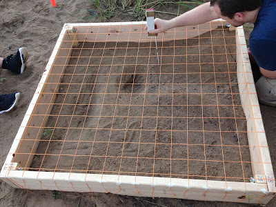
Figure 1.1:   Sculpting our sandbox to specifications
 previously determined
The task our group was faced with was to design and survey our own structures within a 114cm x 122 cm sandbox. The parameters that our group was given was that we needed to included a ridge (elongated structure with a high point), valley (depressed that is longer than it is wide), a depression ( inverted hill), hill ( a elevated area that is not as long as it is wide), and a plane ( a flat area that ranges over a long distance).After construction of the features where built we were tasked to come up with our own form of surveying the features accurately and efficiently. Meaning we needed to have enough points to accurately show all the features but not to many to over collect and have faulty data. 

Methods:

We decided to take our total box which was originally 114cm x 122cm and cut off 1 cm from each side so we could accurately measure each grid. The new area of the box is 112 cm x 120cm.We then made grinds on both sides every 8cm, this allowed us to have a total of 210 sections within the total area to measure for elevation. We decided to keep accurate measurements by labeling the top of the grid by letters and the side by numbers. We then made each measurement within the grid in the lower right corner of each square. Since the features where all below the string we collected all negative numbers. To make the analysis easier in future applications we measured the width of the boards and added the width to all collected measurements. This helped by making all of our data points positive numbers but also keep accurate measurements of the true heights. 
Figure 1.2  Demonstrates the grid layout and our collection methods.

By labeling the top in letters and side in numbers it allowed for quick and easy entry into our excel spreed sheet. Once in excel we where able to transform the data by adding 18.4 cm to each measurement resulting in our final collection. 

Figure 1.3  Final data points of sandbox collected in cm

Discussion: 

Overall our collection went well we had very minor complication. We where able to set up design and collect all the points in one day. It was on Tuesday September 15, the weather was partly cloudy with a light wind and about 82 degrees. Since we where able to collect in one day we did not have to worry about our design being altered or destroyed. A few of our concerns with the collection where as follows. First we had some variation in collection since we where switching between two people measuring. Making it possible that one was measuring different than the other and could lead to slight variation in collection. Second we were not allowed to fasten the string to the wood with anything other than tape making it possible for the string to move or sway if you placed your hand on it. This allowed for some of the collection to be in the wrong spot from where we previously picked of lower right corner. Our last concern was that the area was not placed on a level ground which could have lead to altered measurement where we where not collecting at a perpendicular down angle leading to larger lengths than what was the actual measurement. 

Conclusion:

This activity not only interesting but represented a lot of tools that we will need for the rest of the semester. Some of those tools being critical thinking, problem solving, adapting to the surroundings, team work, and precision collection. The task covered all of these areas which we will be faced with for not only the rest of the semester but also into all of our careers. We where given a task with very little direction. I really enjoyed this activity and hope they continue to be similar task given to us. The task was not only challenging but continues to work on key skills that will advance any student to greatness in the workforce.